AXOLOTL
VISUAL COMMUNICATION - DECEMBER 2022
BRIEF


Visual identity design for a brewery in Lambrate, including labels, coasters, menus, flyers, and adhesive lettering.
IDENTITY
The brewery’s identity is inspired by Mexican culture, specifically the “Día de los Muertos” celebration and the popular traditions associated with this day.
To design the logo, I chose to take inspiration from an animal native to Mexico and considered sacred: the axolotl. The brewery was named after this unique creature.
After several logo drafts and explorations, the final version was selected for its symmetry and versatility.


For the typography, I chose a lettering style in line with the concept: Calavera—used in its different variations for the logotype and headings.
For short texts, I used the font Rye, while for longer passages I selected a classic Helvetica.
WORK PROCESS
1. The Beers
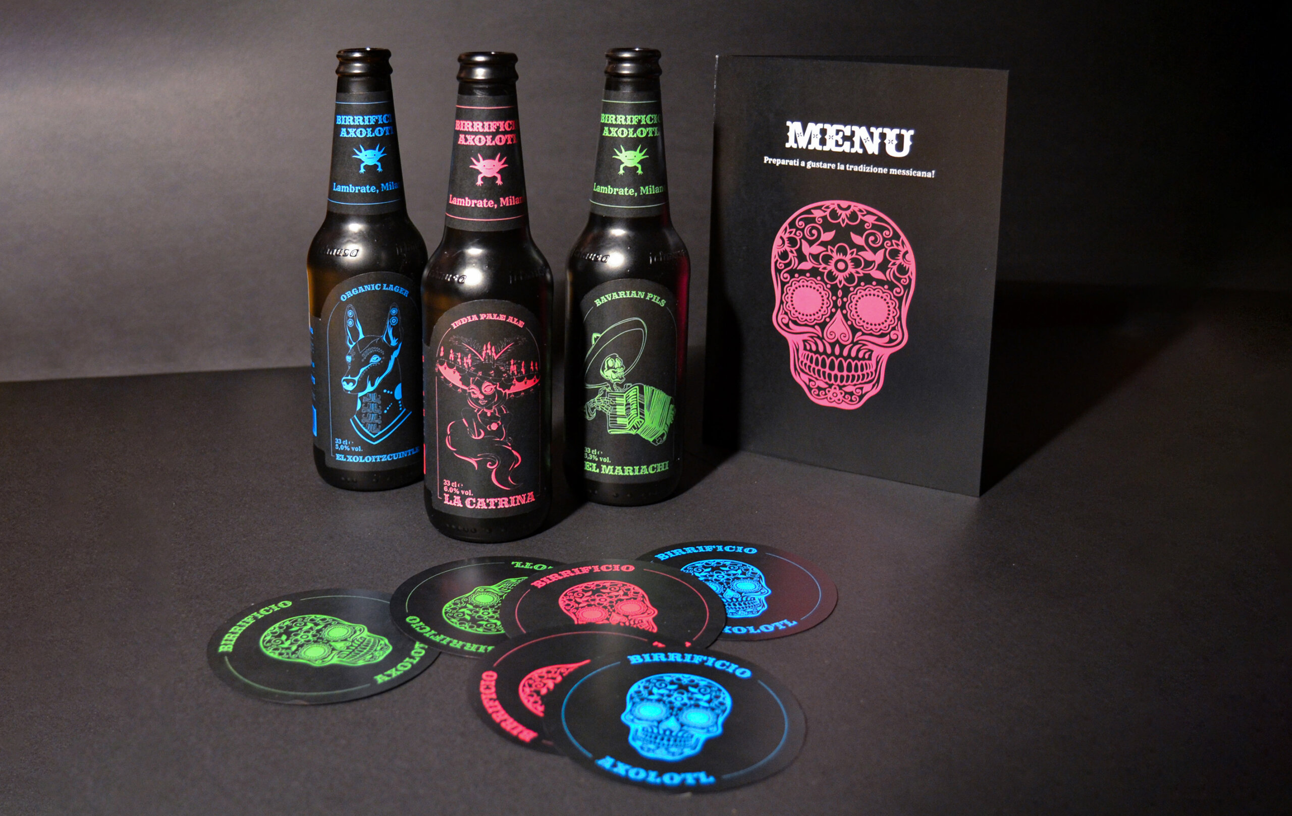
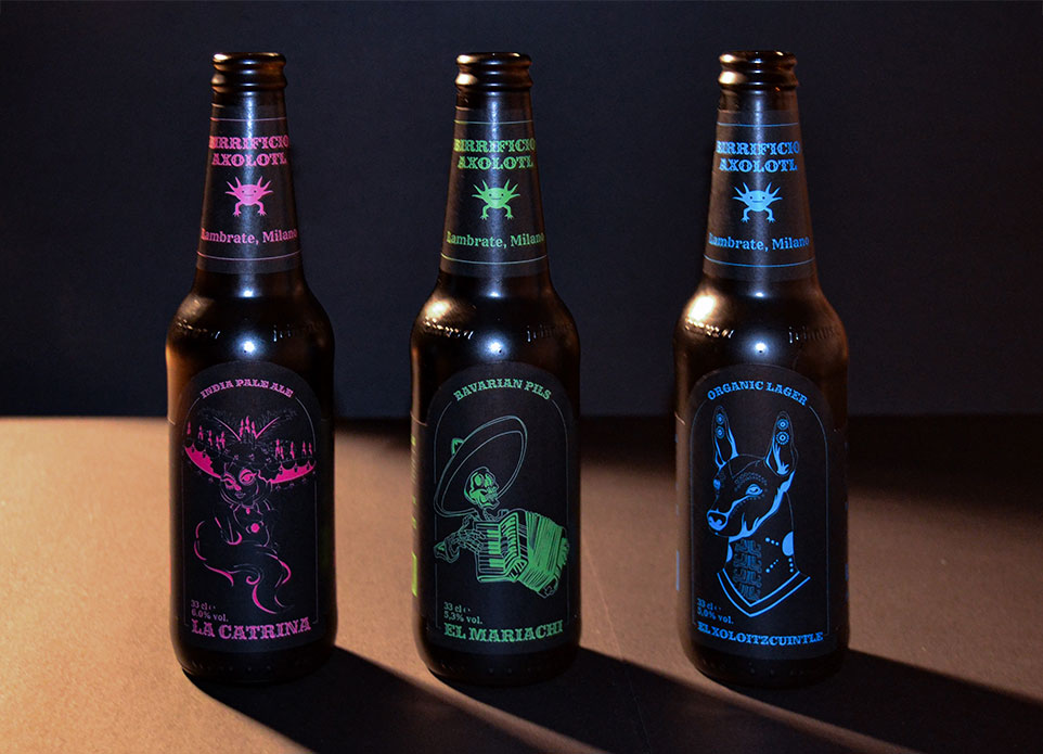
For the beer labels, I decided to portrait characters related to the “Día de los Muertos” tradition: “La Catrina,” “El Mariachi,” and “El Xoloitzcuintle.” Each was illustrated in a stylized form. The color palette consists of three vibrant hues that contrast well with black, creating a sort of fluorescent effect.
2. Menu
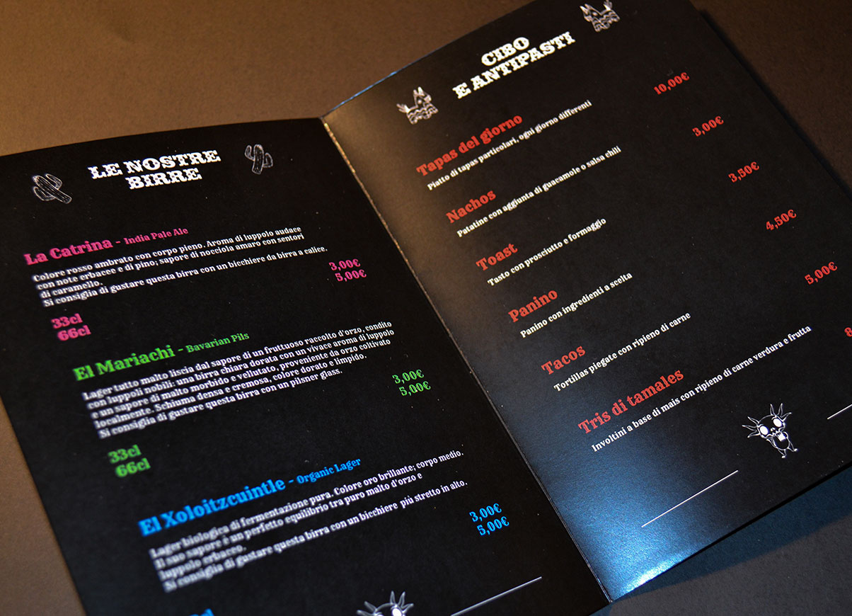
The restaurant menu was designed in A5 format, following the same key visual and color palette used for the beer labels, with the addition of the color red. For the cover, I chose a Calavera (decorated skull, typical of the “Día de los Muertos”), while inside, the menu lists beers, food, and appetizers in the Rye font.

3. Coasters
For the coasters, I also chose the Calavera skull style used on the menu, paired with the “Calavera” font and the same graphic style as the beer labels. The selected format is circular, with a diameter of 9 cm.
FINAL RESULT